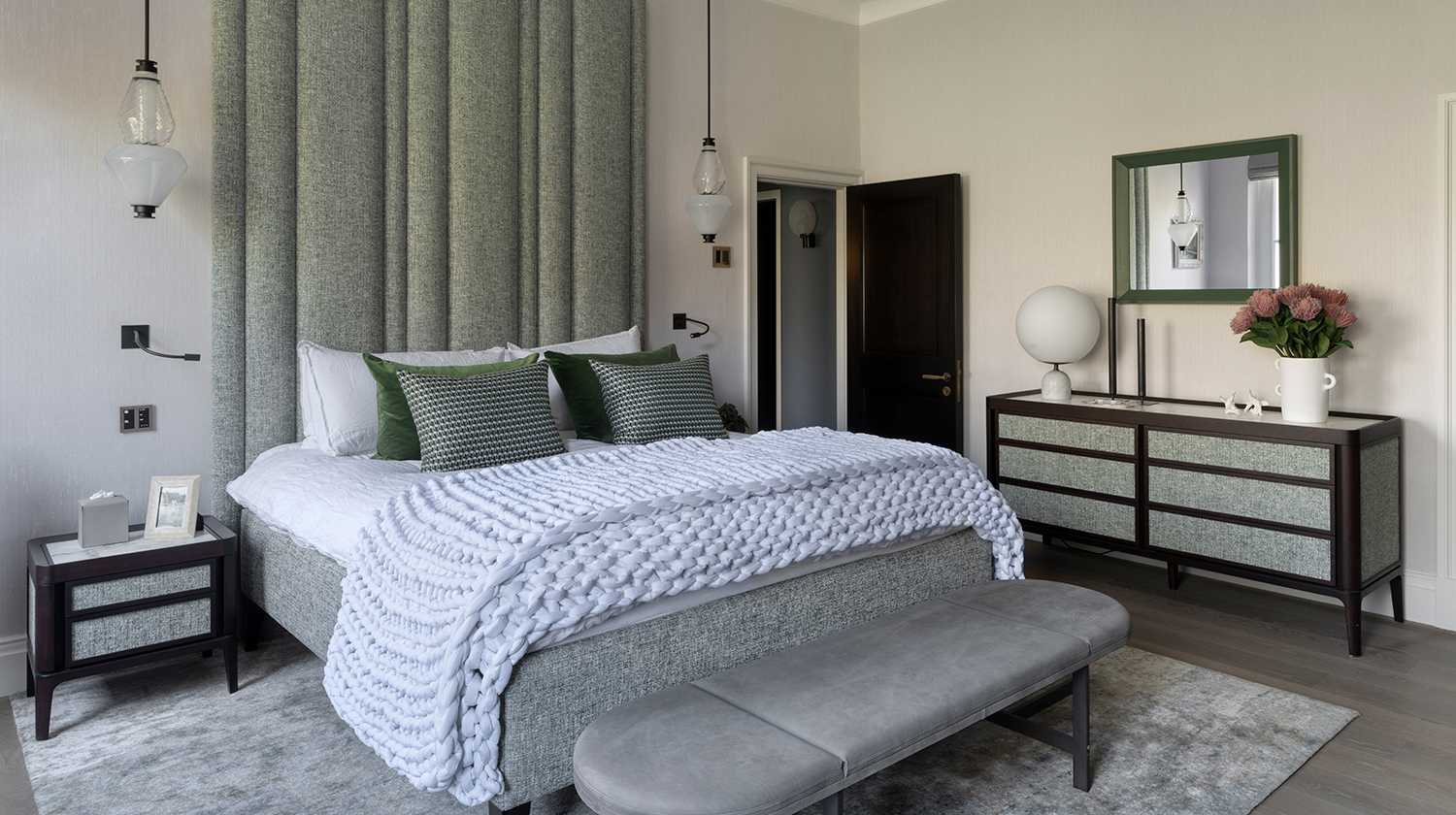
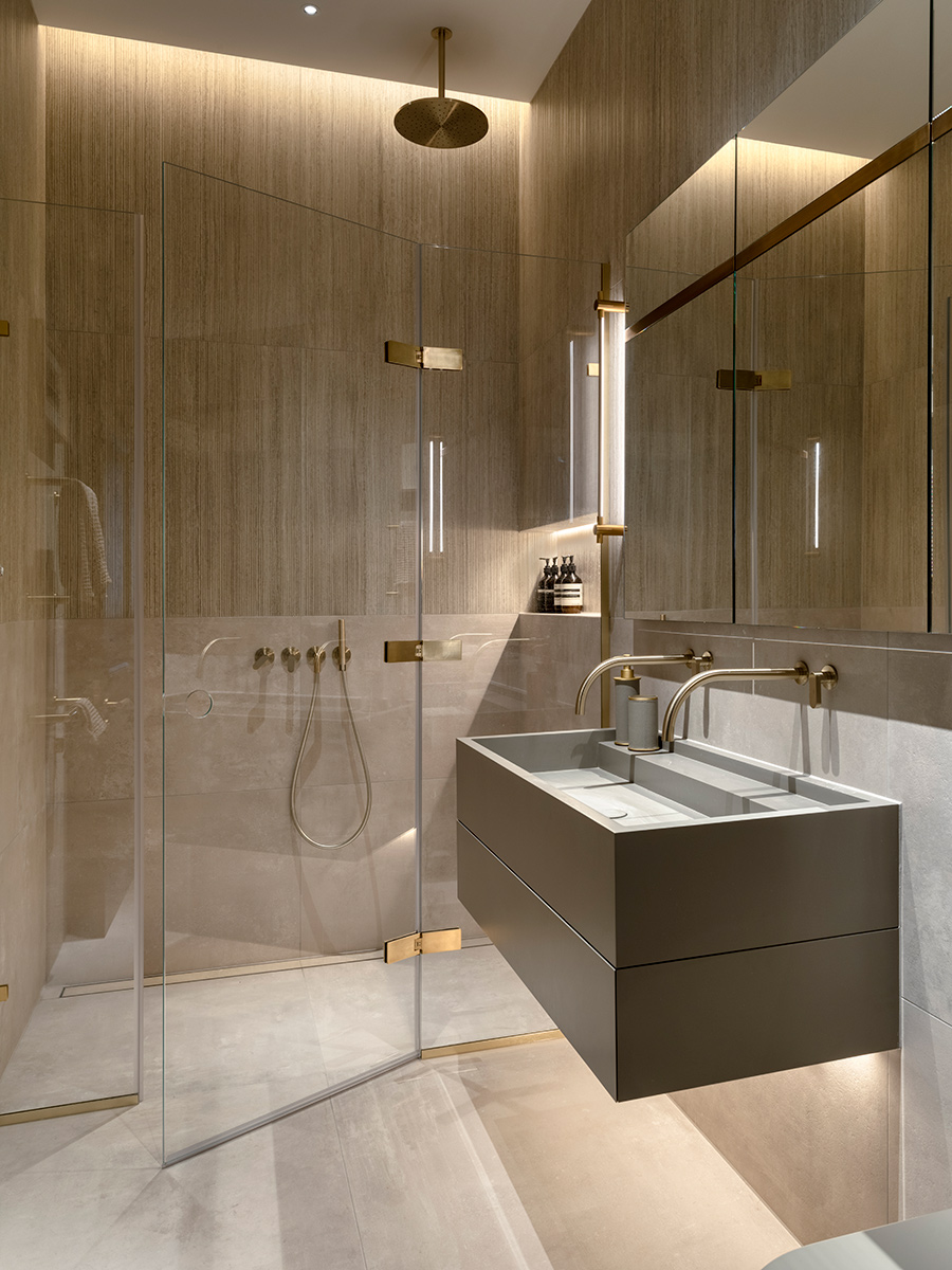
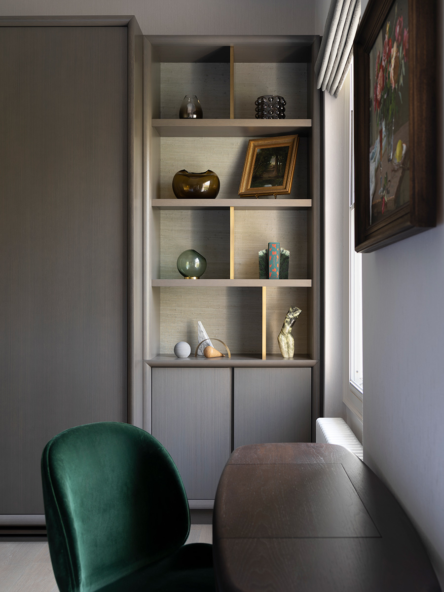
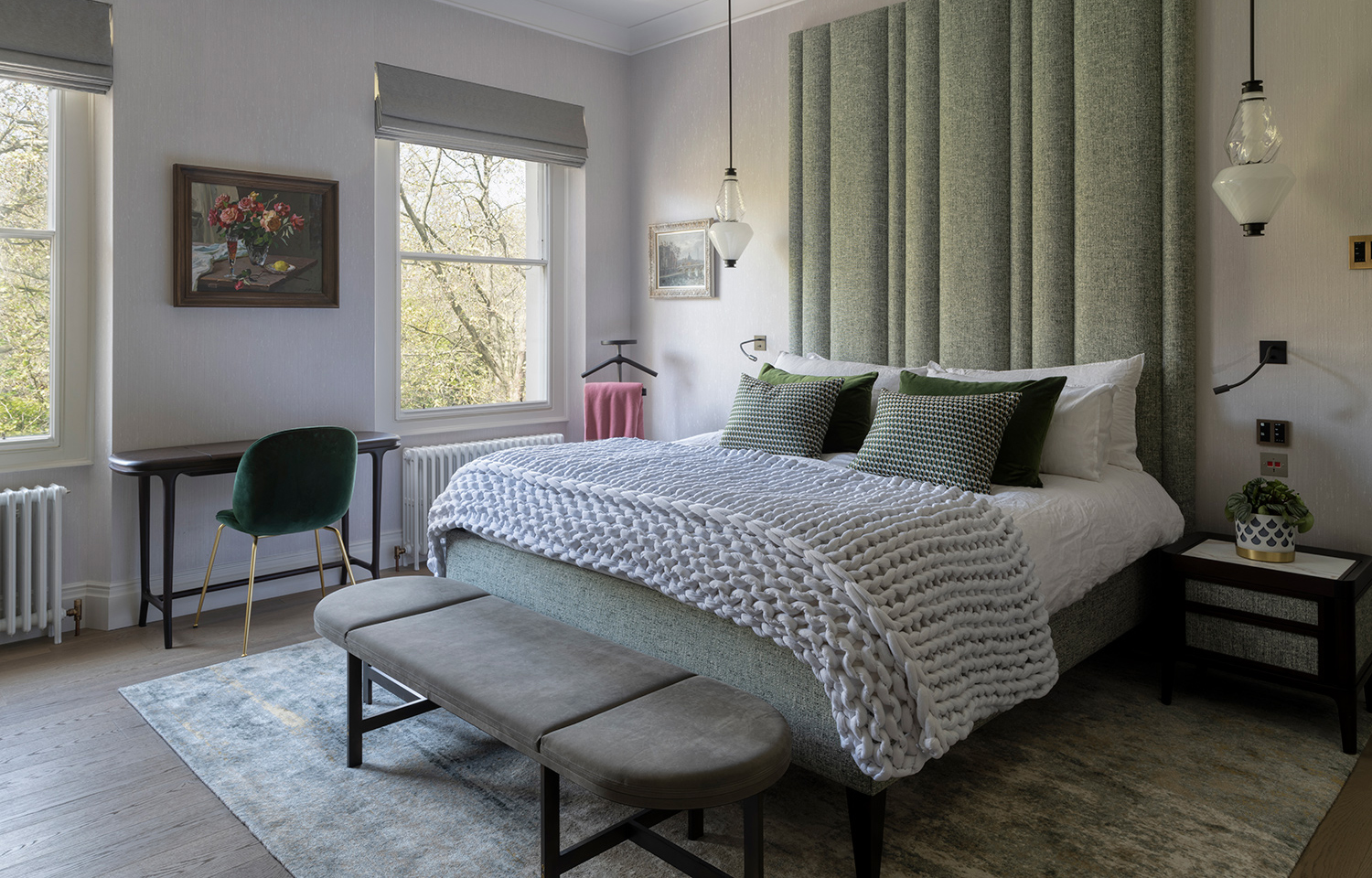
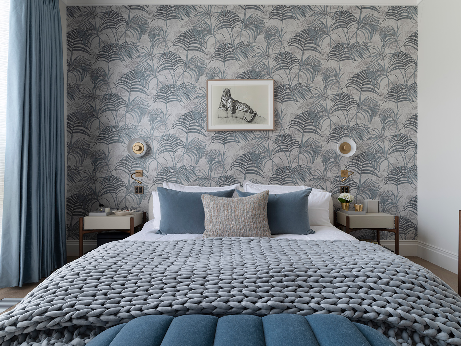
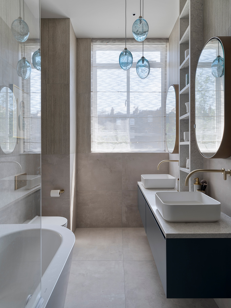
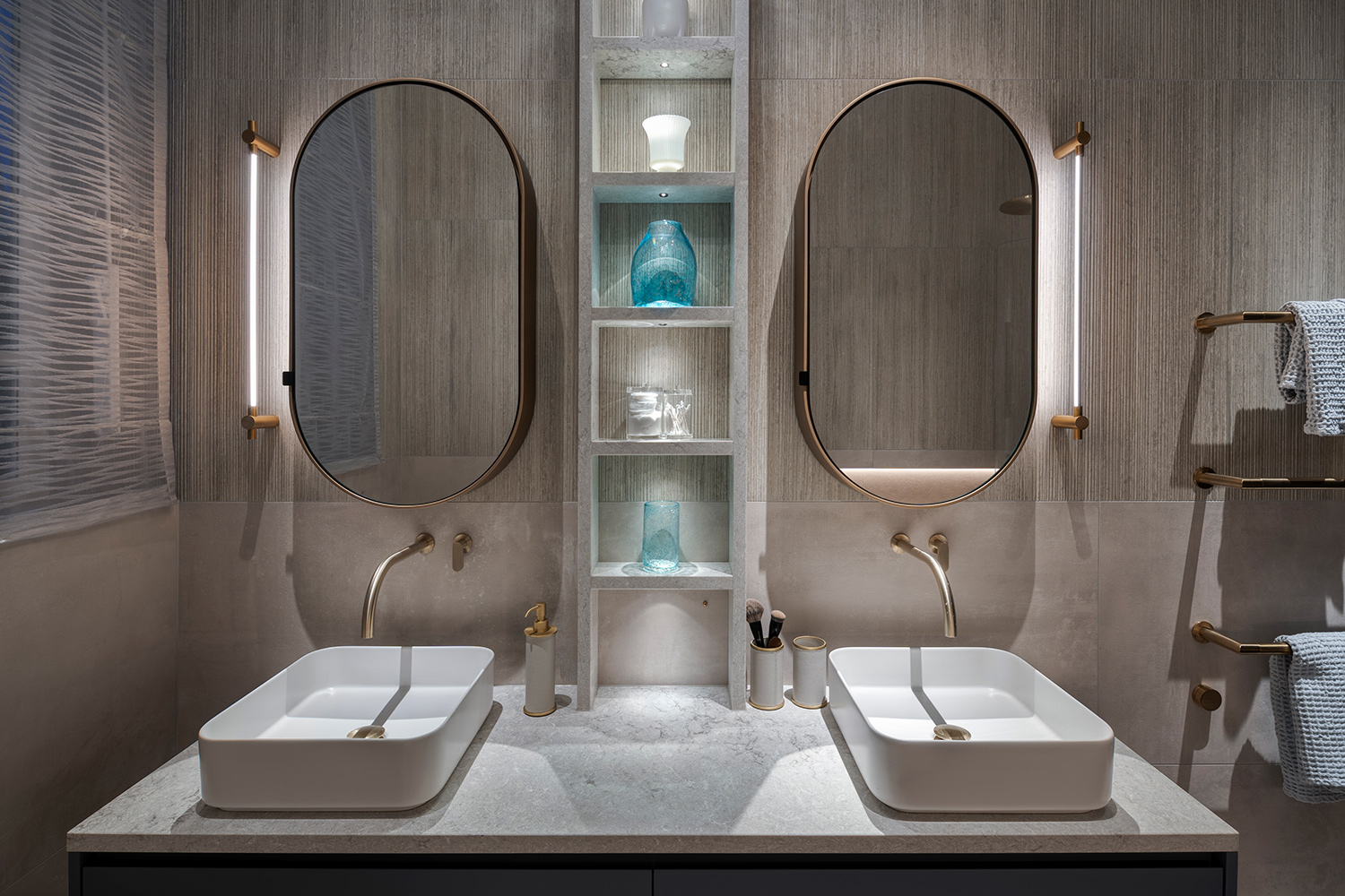
Some clients just have a je ne sais quoi about them. A way of embracing life, projects and challenges and making them less challenging. More … (dare we say it?) … fun. This was such a client, and this was such a project. Challenging in a Grade II listed, Covid-treacle way, but still, so much fun.
Our brief was to modernise this belle of Belgravia and imbue a sense of joy through each of the beautifully proportioned rooms. Working with Sally Storey at John Cullen Lighting, Eggersmann London, Tillman Domotic and Capstone Contractors, our design journey together was full of creativity and collaboration. Even if it took a little longer than we all hoped, the final, joyful, result is one of our favourite projects.
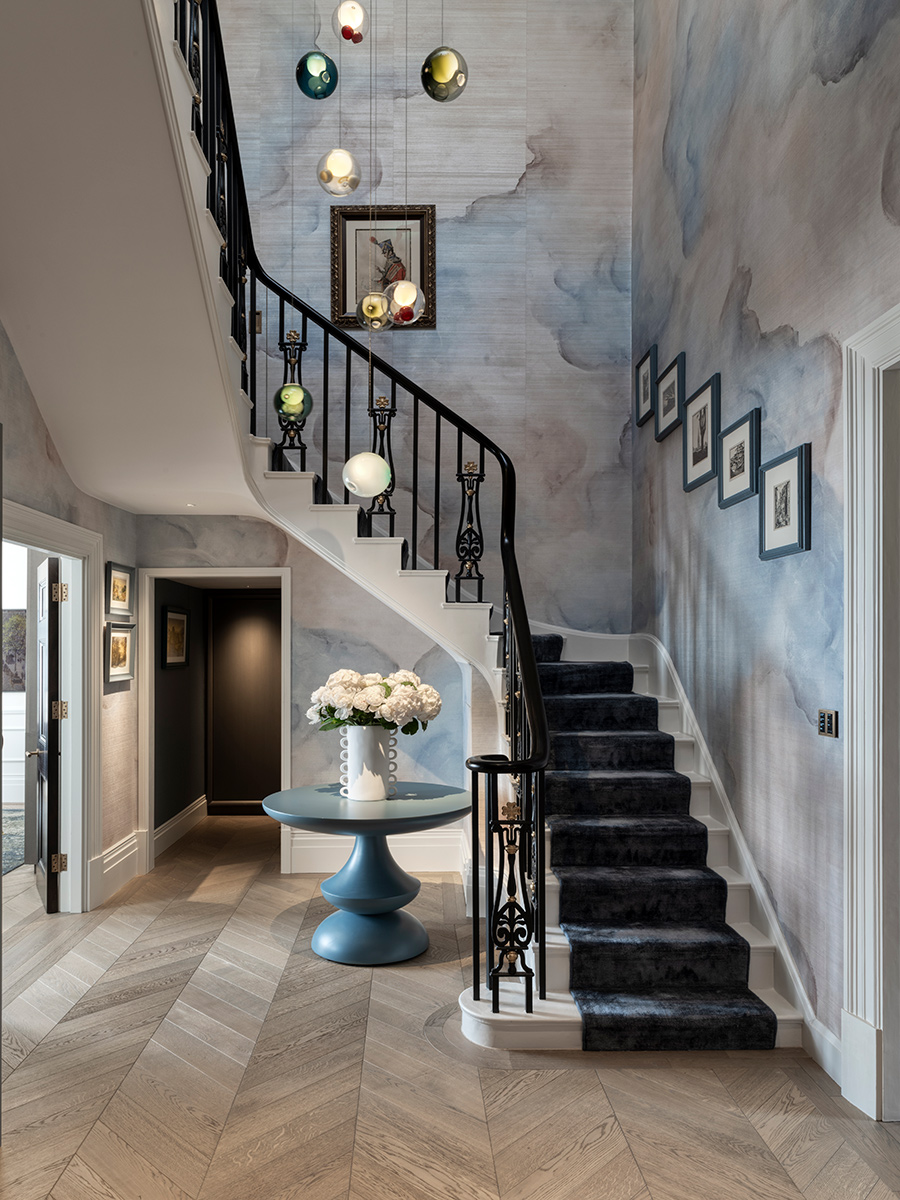
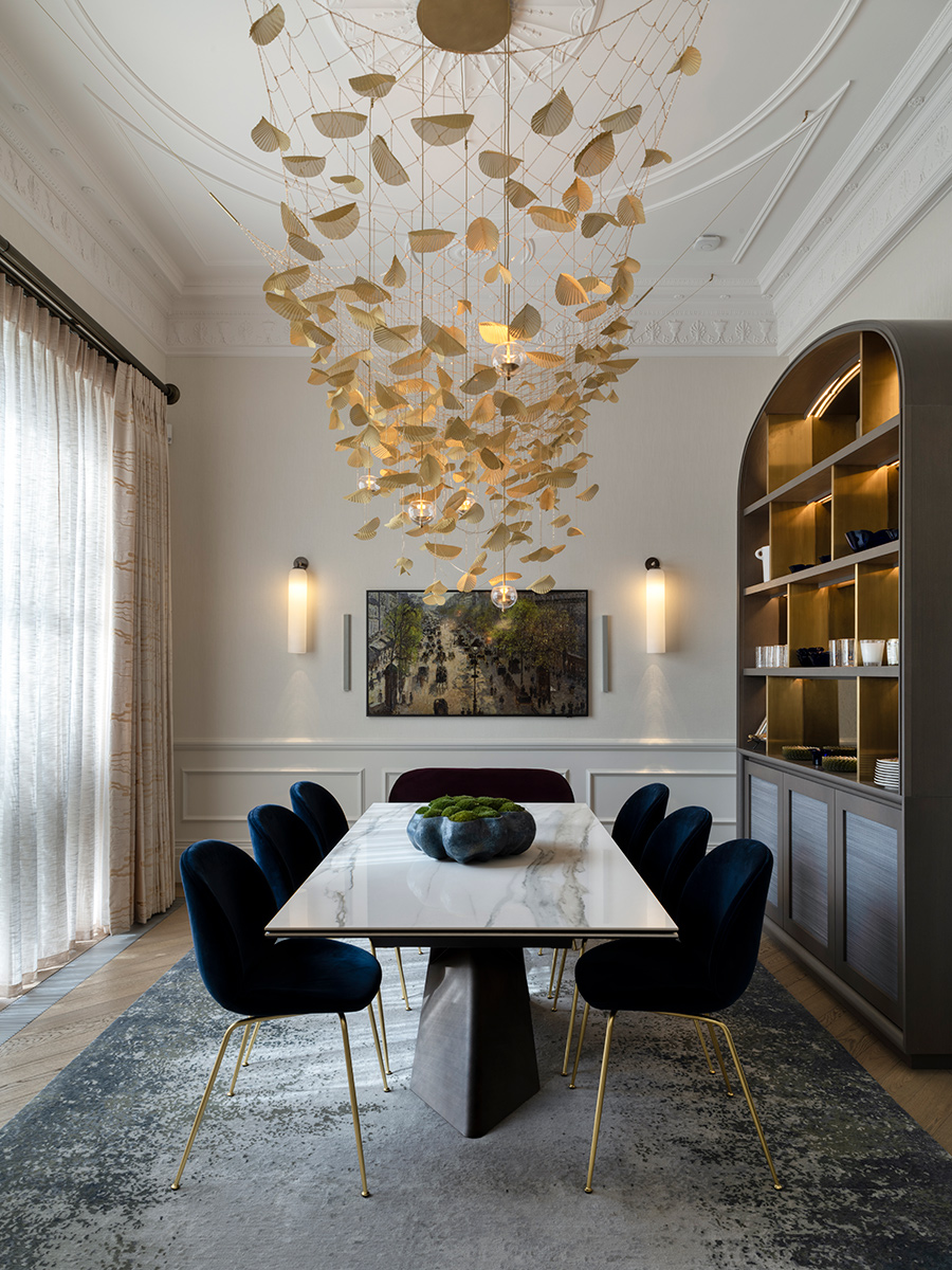
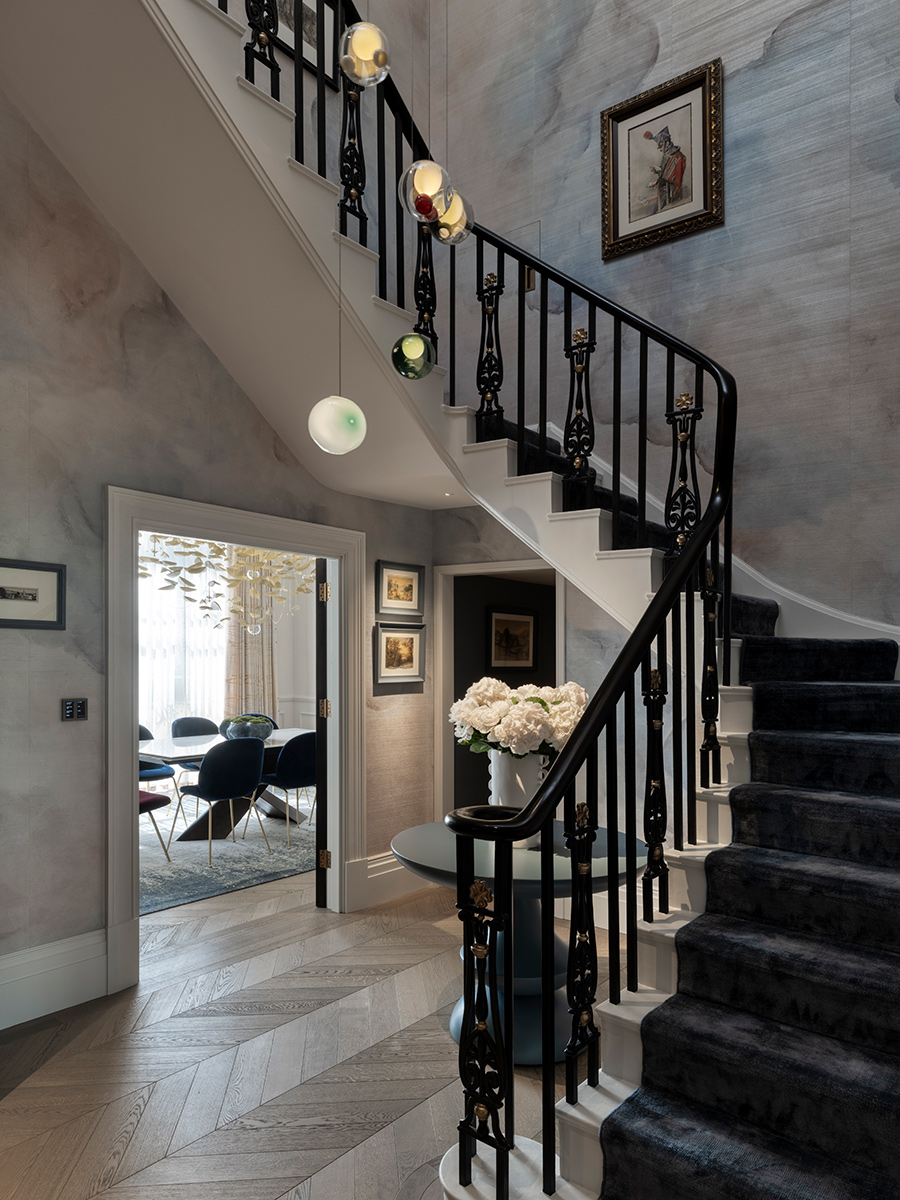
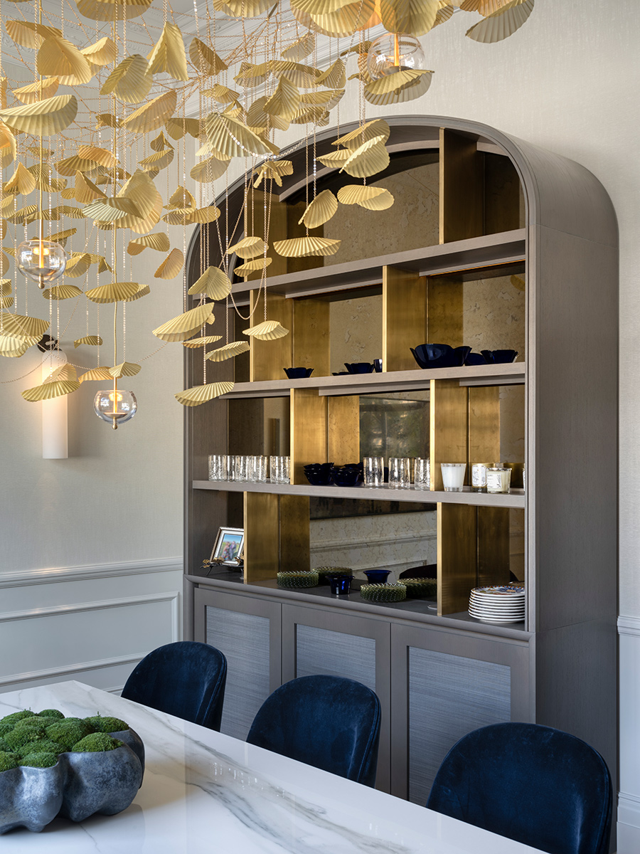
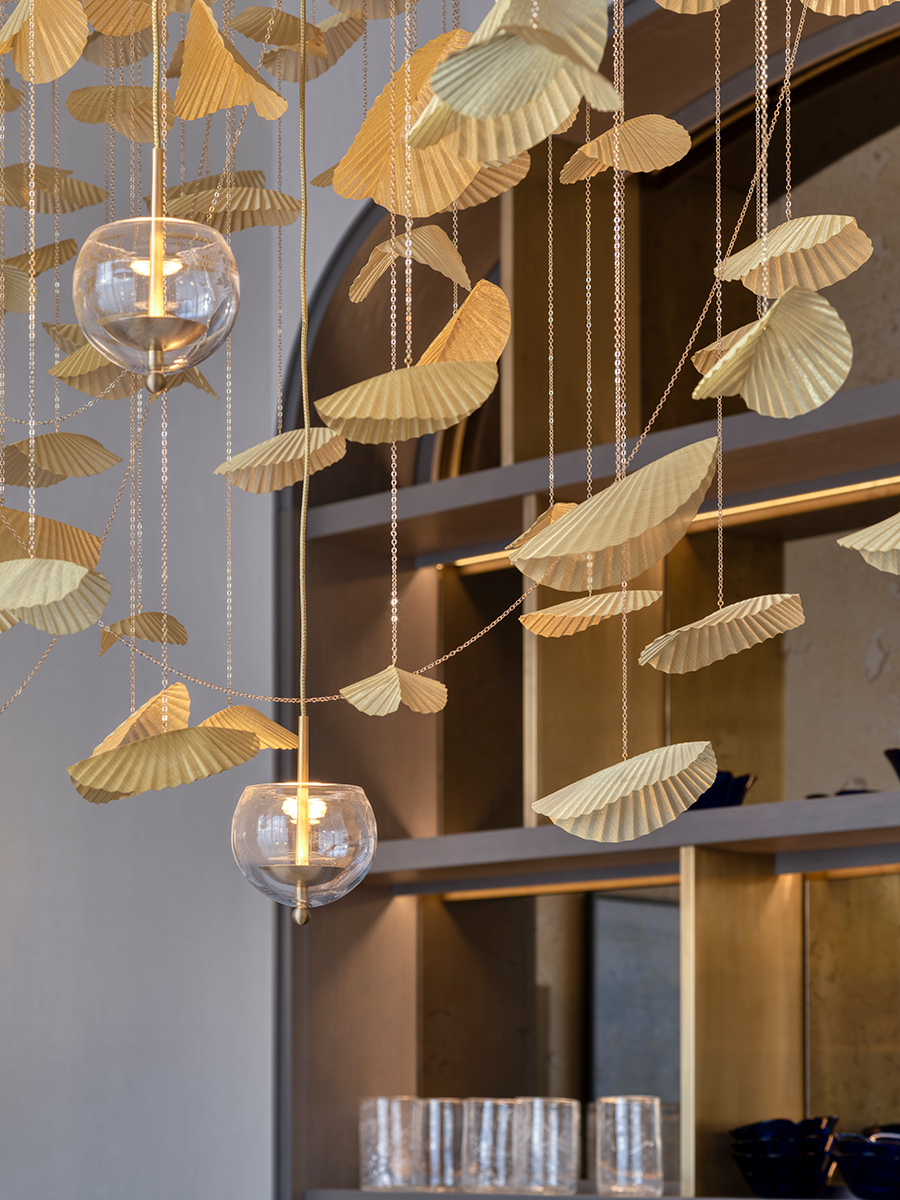
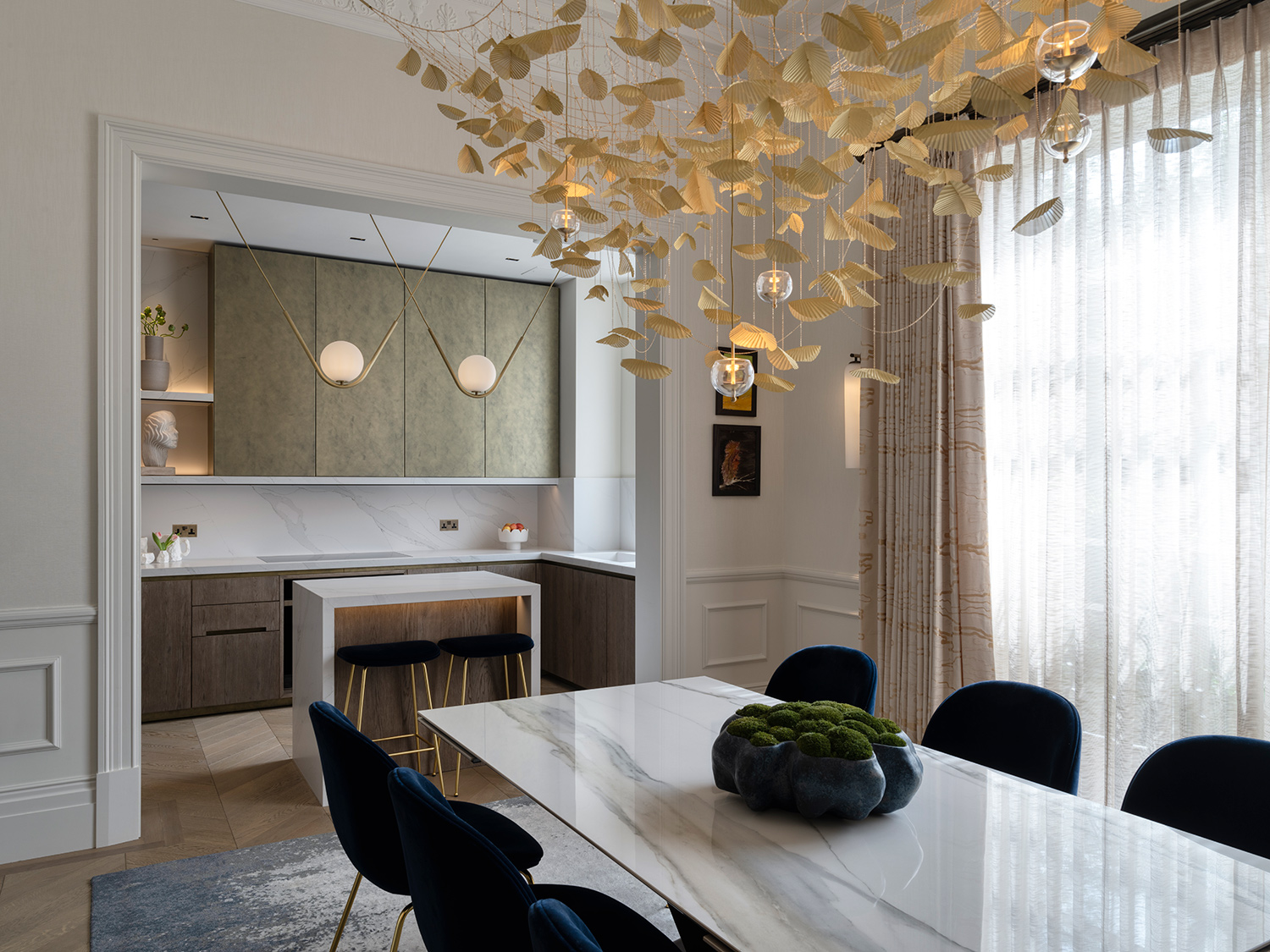
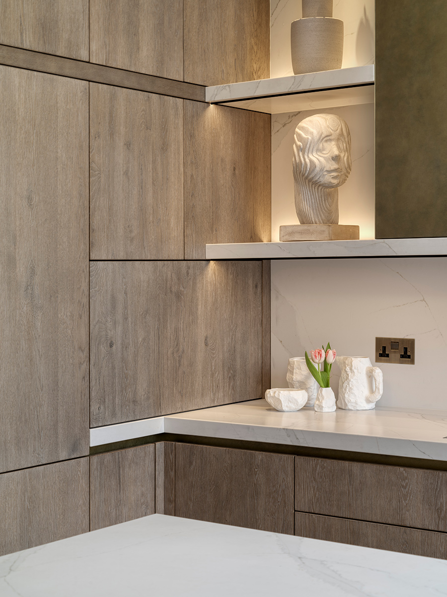
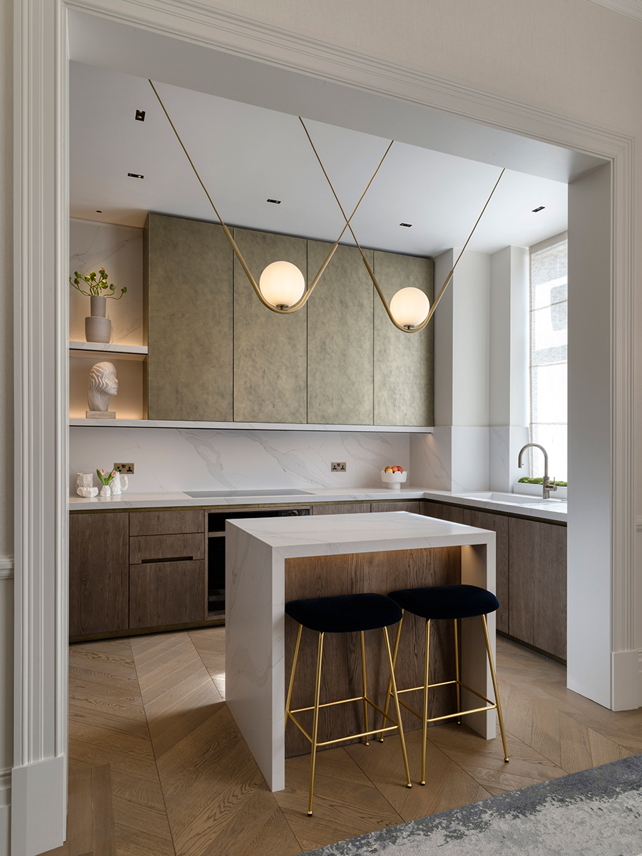
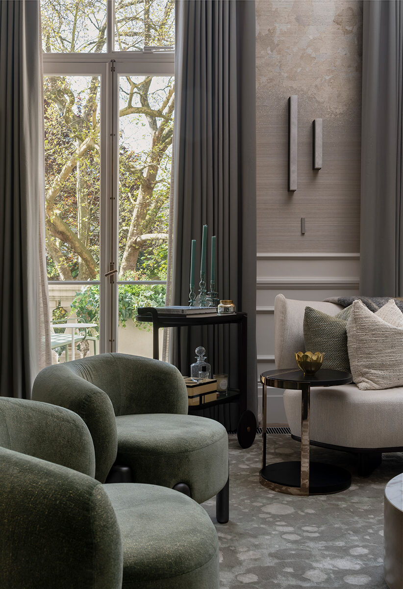
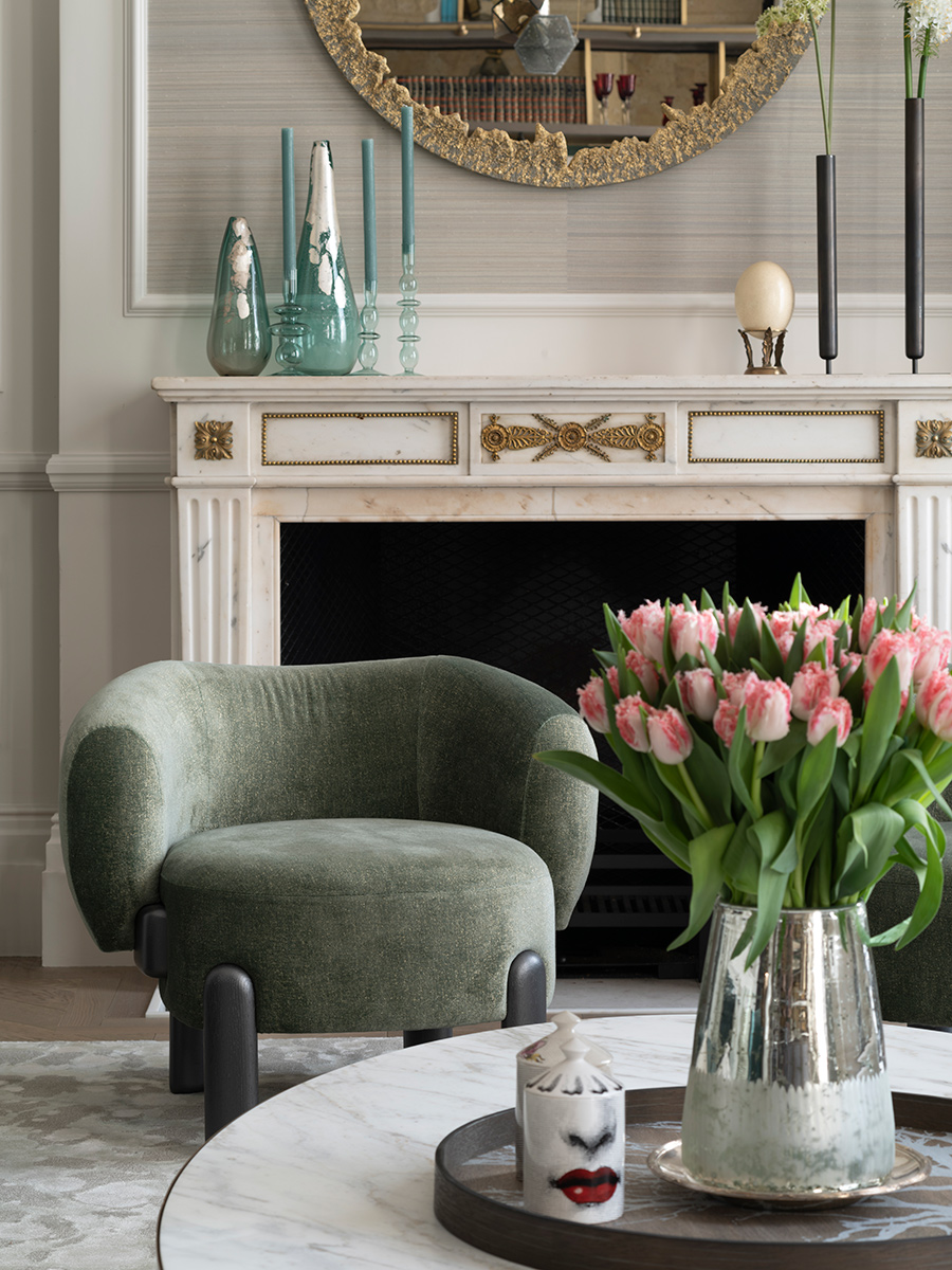
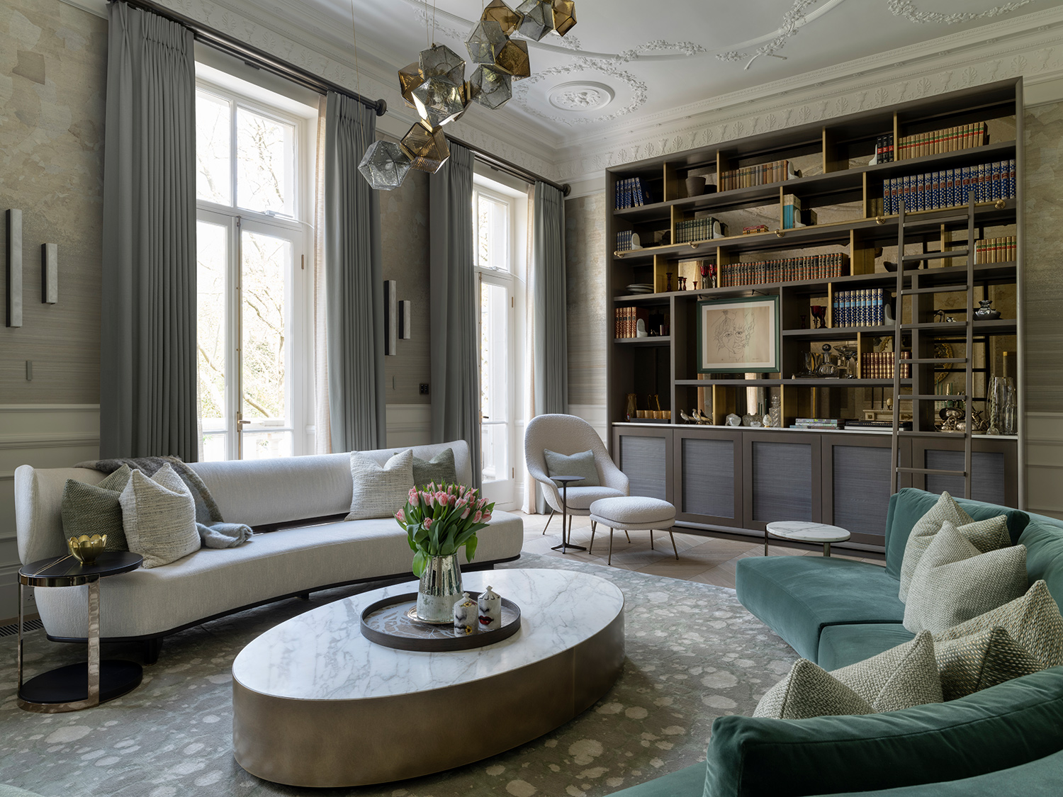
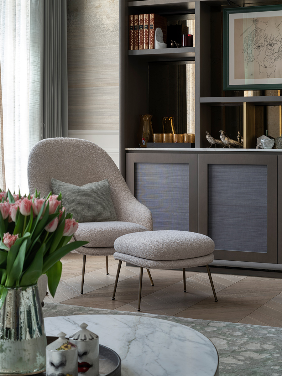
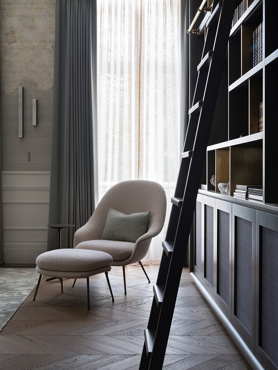
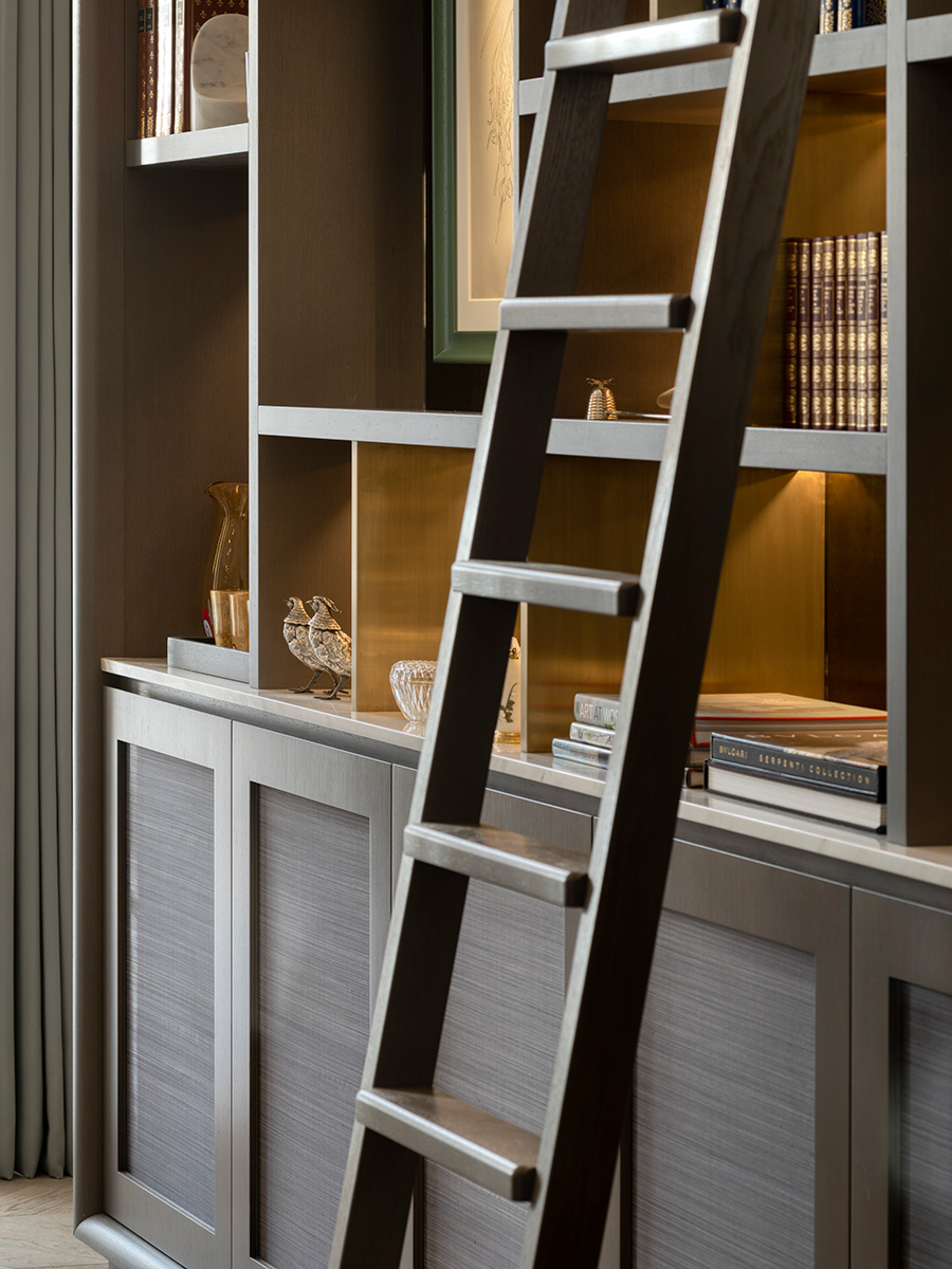
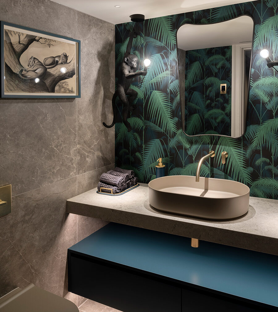
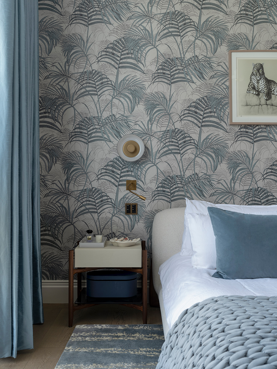
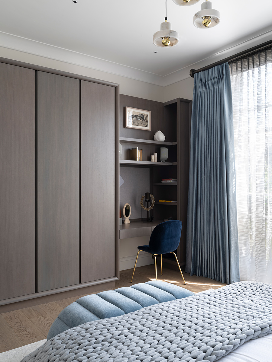
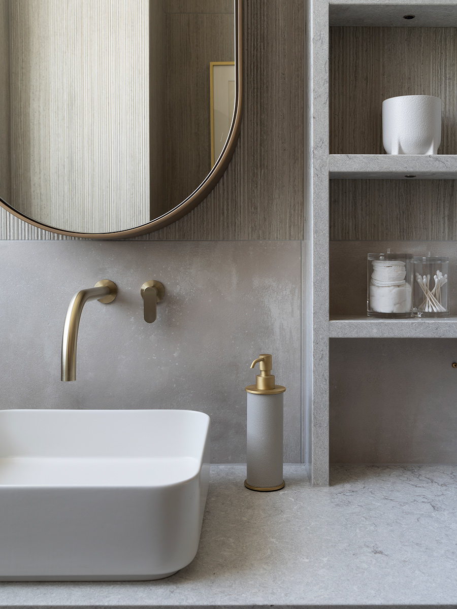
We opened up the floorplan to increase the flow between the key entertaining spaces on the lower floor, creating an open-plan dining and kitchen space. 21st technology pervades the apartment but is cloaked in ninja-esque invisibility. The joinery was sensitively designed to evoke a traditional elegance, but with uncluttered contemporary lines. We used an array of wallpapers and wallcloths to add depth and glamour and some incredible sculptural luminaires in each of the key spaces, working with international ateliers Articolo, Bocci, SKLO, Gabriel Scott, Roll and Hill and Larose Guyon. Our client’s artwork collection was one of the key threads to weave through the design, and was considered early on in each of the room schemes, influencing the final layer of accessories carefully selected in the final stage of the project.
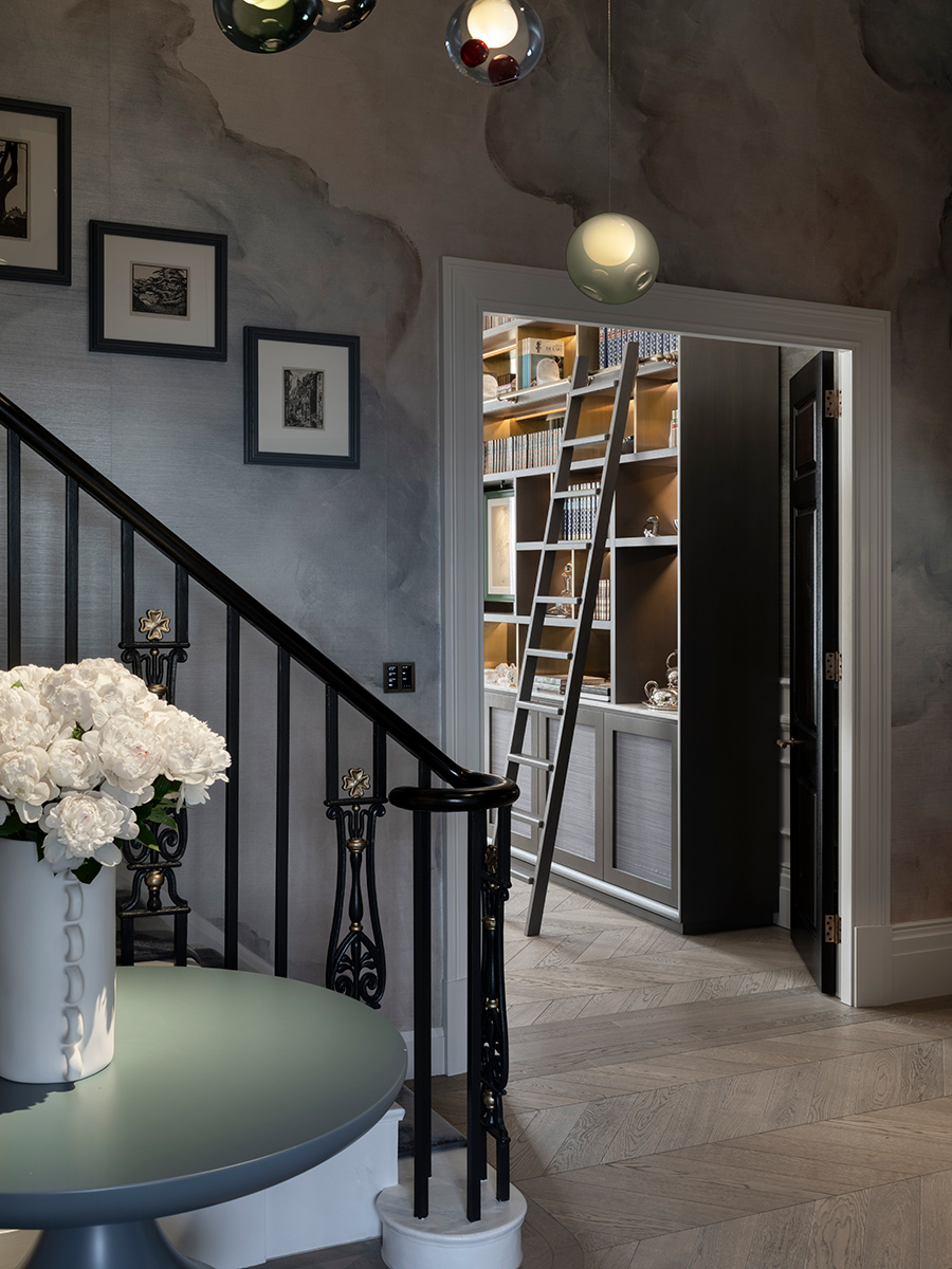
The palette was established with the chevron floorboards from British firm Cheville Parquet and then enhanced by traditional elements including dark stained doors and traditional architectural elements. To this we added natural wallcloths from Phillip Jeffries, using their impressionist cloudscape ‘Flight’ in the hallway to create an elegant and happy hello in this important space as well as a luxurious and artistic backdrop in the reception room. The selection of furniture and lighting (we have coined the more elegant term Belongings to describe this stage instead of the clunky alternative of FF&E) highlights our client’s desire for a home that juxtaposes classic elegance with artistic individuality, bringing together ‘forever’ pieces with some more contemporary or whimsical moments. Pieces from Ceccotti Collezioni, Porada, Riviere, Meridiani and Philippe Hurel dialogue with modern classics from Gubi, Galotti & Radice and Baxter: the apartment feels elevated and considered, but it doesn’t take it itself too seriously. Our client’s desire for an English home-from-home has resulted in a creative, zingily joyful yet grown up apartment that sits easily in its august surroundings, quietly sparkling after its 21st century makeover.
With thanks as always to Richard Gooding who photographed this apartment with grace and generosity.
